Monday, 23 December 2013

Audacity

I want to use Audacity for a part in my trailer where the Antagonist is talking on the phone.
I'm going to record the Antagonists lines, and edit them in Audacity to make them sound like they've been taken from a phone call.


I watched this video to see the process of changing the voice:

Prelude and Action Music.

This is the ending music to my trailer.

This is called Prelude and Action by Kevin MacLeod.

Dark Fog Music

This is the beginning song for the soundtrack to my trailer.

It's called Dark Fog by Kevin MacLeod.

Sound ideas

I was searching for songs to use in my trailer and I came across two soundtracks that I think would work really well in my trailer. I found these on a site called Incompetech, they are royalty free and do not require permission to be used.


The trailer will start with the Dark Fog music and after the Phone Call will go straight into Prelude and Action.

The descriptions used to describe the music also fit my trailers plot and the Crime Thriller genre.


Wednesday, 18 December 2013

Poster Photo's

Today, I took several photo's for my poster. I will only be using one of them, so to decide which photo I'll be using, I'll be doing a vote. Whichever picture gets the majority vote will be the picture I use for my poster.

These are the pictures:

Picture 1:


Picture 2:


Picture 3:


None of these photos have yet been edited. It's likely I'll cut around the photo and place it on a new background, so it's mainly the way the protagonist is positioned that I would like people to vote for.

Sunday, 15 December 2013

Filming: Day 2 - Scene Stills

The first shot of the day was the missing poster. I wanted to get this out of the way first since it wasn't too windy at this time. 


The second scene was the conversation, which is included to reinforce the story.


The final shot was the establishing shot, which opens my trailer.


Filming: Day 2

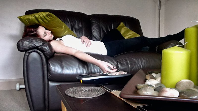
On day two of filming, I filmed the missing poster shot, the brief conversation and an establishing shot. These scenes took place at my first location, which was on Moor Lane and on a field just behind the college. These settings were ideal for the shots as it shows the extent of the search for my protagonists sister.

The first shot was the missing poster. I wanted to have a medium close-up shot of my protagonist putting the poster up, and then to zoom in on the poster slightly to establish the importance of this poster. The camera was held by me just on the left of the pole that the protagonist puts the poster onto.

The reason for this scene is to start establishing the plot to my trailers target audience. It also introduces my protagonist and her sister, which is key to allowing my audience to see who the main characters are in my film.

The second part of our filming session was the conversations between my main protagonist and a small role. It was an over the shoulder shot of the other character that focuses on my protagonist. The character says "We'll help you find your sister" - this line confirms the narrative of my trailer and starts to interest the audience into finding out why she's missing.

Finally, I filmed an establishing shot of the field. This shot is a common feature in a Crime Thriller trailer - In all three of the trailers that I had researched, an establishing shot was used. I specifically did this shot on this day as the weather was dull and grey- this is pathetic fallacy that reflects the mood of my protagonist and the atmosphere of the trailer.

Filming lasted approximately just under two hours. This was due to change of idea's on angles, repeating scenes if lines weren't said right or if something went wrong and to make absolutely sure that I was happy with how the scene/shots look.

Friday, 6 December 2013

Filming: Day 1 - Scene Stills

 The first still is from the first shot we did, where Catherine (the protagonist in my trailer) is asleep on the sofa and the phone starts ringing.


The second still is from the second shot, where Catherine answers the phone.


Filming: Day 1

On the first day of filming, I decided to get the phone call scene filmed. This took place at Charlotte's house, my main actor in my film trailer, as the setting was ideal and exactly how I pictured the scene to be.

The scene was to be a mid-to-long shot of my actor, who was to lie on the sofa until the phone rang, instructing them to get up and answer. The camera was positioned behind the coffee table that had the phone on with my actor in shot, lying on the sofa. Since the phone would be almost center in the shot, this would put the main focus on the phone- showing it to be an important object in the scene.

The reason for this scene is so that it establishes the disequilibrium in my trailer, which is key to gaining the interest of my audience.

The filming session was efficient and didn't take too long to get finished, leaving us enough time to edit the clips and finish off any outstanding work left to do for our trailer.

Filming Schedule

6th December - Phone Scene

12th December - Missing Poster, Conversation, Establishing shot

15th January - Antagonist voice clips. 

20th February - Walking Down Street, Gun pointing to Camera

22nd February - Tapping fingers (ring), Instructions through letterbox, List numbers

23rd February - Phone shot, Instruction pick up, Pulling gun out of bag


Thursday, 28 November 2013

Trailer Storyboard


This is my storyboard for my trailer. This is an idea so that I have a plan of what shot I could include in my trailer. It's likely I won't use all of the shots I have put, however this does give me a foundation to start doing filming for my trailer.

Prop 2: Missing Poster


The prop of the missing poster will be used very early on in my trailer. This will be used to establish narrative and characters. Additionally, it could also establish genre, since missing posters often appear in Crime Thrillers.

Tuesday, 26 November 2013

Protagonist's Costume


This is my main protagonists costume. All costume items were similar to the ones I wanted and since I am on a budget, I want the costume to look good but inexpensive.

Target Audience


To decide upon a target audience for my film trailer, I did some research on a few Crime Thriller films. On IMDb, the age rating of the film is just underneath the title of the film on the films page. One of the movies I looked at was 15, and the other two were rated R.

The UK Equivalent to an R rating is 15 - as both Prisoners and Homefront were rated 15 in the UK, as shown on the Cineworld website.


Based upon this information, I have decided to make my film trailer rated 15 too. All three films include violence and strong language, and as violence will be included in my film, a 15 rating is appropriate.

Character names and description

Katherine Richmond (Kat or Kate for short):
Main protagonist in the trailer. Red hair, small-medium height. Very close relationship with her missing sister, making her determined and desperate to get her back. These traits mixed with her vulnerability make it so she will go to any means to get her sister back safe and well- so when she receives the call that her sister is being held hostage, she doesn't hesitate to do what the person on the phone says. She's brave and despite the impression that she's naive and desperate, she's quite cunning and smart.

*Important character in the trailer. She will be in a majority of the scenes.


Jessica Richmond:
Kat's 15-year-old little sister. Has dark blonde hair and is quite small in height. She's got a very close relationship with her sister, hence her sister's desperate determination to get her back.


*Does not appear within the trailer, other than on the missing posters (where some of this information is given).


Unnamed Antagonist:
The person holding Kat's sister hostage. Not much information is given on this character, as this entices the audience to find out who this person is and why they've kidnapped Kat's sister. There is an inclination that this character may know Kat personally, as they have confidence in her doing the 'jobs' that they require she do for her to get her sister back, and gives her the nickname 'Kitty Kat'.

*This character doesn't physically appear within the trailer other than his hand, but does speak on the phone. Having the mystery on who this character is will be key in intriguing my target audience.

Thursday, 21 November 2013

Scene Idea: Phone Call

I had the idea of a scene in which the main protagonist is asleep on the sofa. Then, the phone rings causing her to wake up and rush over to it in hope that it's her sister. When she answers, no-one speaks for a moment, then someone speaks and says "Kitty Kat, Kitty Kat, what will you do to get your sister back?".

This scene will establish the narratives disequilibrium. The effect of it will increase the trailers tension, grab the interest of the audience and also allow the films narrative to make sense.

Actor 3: Antagonist


For my Antagonist, the actor can be anyone as their face will never be seen in the trailer. This creates suspicion and will get the audience interested in finding out who it is that has taken the protagonists sister. However, the Antagonist will need to wear a wedding ring as this plays a key part to the narrative of my film and also make the audience question why we see a wedding ring in the trailer. Also, their voice will be heard and I wanted them to have quite a distinct voice.

I chose my dad to play this part as his voice is really quite distinct and he's already got a wedding ring, which means it isn't required for me to try and get a ring as we have one to use. If I had a teenage boy play this role, it wouldn't be as believable as their voice wouldn't have sounded as mature.


Costume Idea - Protagonist

I want my protagonist to wear a warm coat, something like the image above. The protagonist will be looking for her sister in the first part of the trailer until she finds out she's been kidnapped, then she'll be taking orders from her sisters kidnappers- meaning committing crimes. Criminals tend to wear dark clothes to remain stealthy and low profile.


Jeans are casual and often worn by the protagonist in any genre of film. For my protagonist, really tight jeans would probably be impractical if she's constantly on the move and in damp weather they would restrict her movement, however fitted jeans would look better and allow for more movement.

Doc Martens will be really practical for my character as they are comfortable and wear well in any location. Since my character would be searching for her sister at the start of the trailer, these would be suitable footwear for her.

Results of vote


The results from my tally resulted in 17 Crimes being the most popular title for my film, so I have decided upon this for my film trailer. 

Title vote


I asked 15 people from my target audience (15+) to select which title they preferred for my film trailer as having opinions from other people would allow me to understand what would attract my target audience to my film trailer. 

Saturday, 16 November 2013

Title Ideas


Prop: Gun altered

I wrapped black tape around the grip and the muzzle of the gun to make it look realistic and give it a more serious look

Prop 1: Gun

I bought a toy gun as a prop in the trailer as I'm thinking about a scene/shot with my protagonist aiming the gun at someone. 

I'm going to cover the orange parts of the gun with black paint or black tape as I think the colour doesn't make the gun seem serious. 

Saturday, 9 November 2013

Location Shot 2


Another location was outside a police station. I was thinking of using this as an establishing shot and using non-synchronous dialogue between an officer and my protagonist while the shot is on to show that the protagonist is there.

An alternative idea could be a mid-shot/close-up of my protagonist thinking about whether she should go to the police after the main disequilibrium of the trailer occurs.

This shot will reinforce the genre of my film, as police are almost always involved in a Crime Thriller, even if they aren't the main protagonists.

Tuesday, 5 November 2013

Actor 2: Protagonists Sister


I chose Charlotte's sister Emily as the missing sister as she is how I pictured the sister to look. Also, since they are actually siblings, the relationship will be believable and realistic which is what I would like my target audience to think about my film trailer.

Actor 1: Main Protagonist


I chose Charlotte as my main protagonist as she is how I pictured my protagonist to look and she has acting experience, making her a perfect selection. Also, I would like her sister to be the sister in my trailer that gets kidnapped. Since they are actually siblings, the relationship will be believable and realistic which is what I would like my target audience to think about my film trailer.

Friday, 1 November 2013

Plot Choice

My plot for my film trailer:

"The protagonists sister goes missing, so a search commences to find her. However, the protagonist gets an unknown call (or text) which says that their sister is being held captive. The protagonist must do exactly what they say so that no harm will come to her."

I asked a few people which of the plots they preferred and they decided upon this plot. Getting their feedback on the plot is key in making sure I know what narrative appeals better to my audience. I like this idea since it's simple, yet as a film could have many different twists, which would allow me to be creative with the trailer without giving too much of the story away. Finally, this idea is practical so getting hold of any items needed shouldn't be too difficult. 

Thursday, 31 October 2013

Plot Idea 2

This is my second idea for a plot:

The main protagonist learns that her parents business is going bankrupt and they need to pay £500,000 by the end of the month to keep their business alive. She and three friends plan a heist on one of the most expensive jewellery shops in the country in an attempt to save her familys business. 

Wednesday, 30 October 2013

Plot Idea 1

This is my idea for a plot:

The protagonists sister goes missing, so a search commences to find her. However, the protagonist gets an unknown call (or text) which says that their sister is being held captive. The protagonist must do exactly what they say so that no harm will come to her. 

Sunday, 20 October 2013

Conventions of a Crime Thriller


 These are the conventions of my chosen genre for my film trailer that I have learnt from my research.


Tuesday, 8 October 2013

Magazine Research - Empire


The masthead of the magazine is at the top centre of the page. It is in a large, bold text and has a simple yet interesting font which is clear and easy to read. The colour of the text on the cover is white and red that stands out against the background. The masthead and sell line have a gradient effect that works in catching the audiences eye and also aids towards the narrative as it looks quite futuristic and metallic, suggesting that the film might be set in space. The colour red may also connote danger, which may be a theme in the film. The main image on the cover covers a bit of the masthead, which suggests the magazine is high status and confident that its audience will know which magazine it is without having to show the masthead, providing the audience with a sense of trust.  Covering the masthead is also a common feature on popular magazines. Above the masthead is the skyline, reading  'Incredible 2013 Preview Issue!' the aim of which is to entice the audience into buying the magazine.

The main image is of the main protagonist in the film
‘Star Trek’ as we can see from the anchorage text in the centre of the page. The anchorage text allows enough information about the main article but not enough to give it all away. The main image is effective as the protagonist is looking directly at the camera, drawing in the audience and giving the impression that the protagonist is looking directly at them and inviting them to read the magazine. Also, the positioning of the anchorage text  grabs the attention of the audience and informs them of the name of the film.

The sell lines are on the right side of the magazine, making the cover look neat and in order. The hints to the topics in the sell lines succeed in enticing the audience into purchasing the magazine. The font is professional and easy to read, and the colours used stay true the colour scheme of the cover, making the cover much more appealing to the eye. Also, the topics help to identify the target audience of which the magazine is trying to attract.

The Mise-en-scene shows the protagonist wearing a futuristic jacket and has some sort of handcuffs on, also looking quite futuristic, which further influences what is included in the film. There is also a piece of text saying 'The planets only access to the years biggest sequel'. This is used as a way of promoting the film, giving it a positive review which influences the magazines audience to go and see it. It also confirms the film as a Sci-Fi, as it mentions planet, which is a convention of Sci-Fi films.


This magazine contains a date, price and website in a small text size just above the 'M' of the masthead and a barcode at the bottom right of the cover. The use of small text allows the main image and sell line to remain the main focus of the cover. This is a common convention on magazines to inform the audience about these aspects.

Thursday, 3 October 2013

Magazine Research - Total Film


The masthead of the magazine is at the top centre of the page. It is in a large, bold text and has a simple font, all of which makes it clear and easy to read. The colour of the text on the cover is white, red and yellow-orange, this stands out against the background and also has some meaning towards the film that it is representing on the front cover as the yellow-orange colour could connote fire and anger while the red could symbolise death. The main image on the cover covers part of the masthead, which is a common feature on magazines. It also suggests that the magazine is of a high status and the creators are confident that its audience will know which magazine it is without having to show the masthead, essentially providing its audience with a sense of trust.

The main image is of the main protagonist in the film
‘The Hunger Games’ which we can see from the anchorage text in the centre of the page. The position of the anchorage text effectively grabs the attention of the audience and lets them know what film it is. The main image is also effective as the protagonist is looking directly at the camera, which draws the audience in and gives the impression that the protagonist is looking directly at them. The age of the protagonist hints at the target audience, as she has minimal makeup and is young, suggesting that the target audience for this film is for around about 12+.

The M
ise-en-scene reveals the setting of the film may often be outdoors, as the protagonist is wearing a jacket. In addition to this, the background is bright and fiery, which not only suggests the narrative but may also tell the audience about the protagonists’ personality. There is also a piece of text which says 'Inside 'the most influential film made in years''. This aids in promoting the film, giving it a positive review thus influencing the magazines audience to go and see it.
 

Above the masthead is two more sell lines which include images. One of the sell lines reads "Bond Babes Face Off" which is aimed at fans of James Bond and also appeals to a range of ages for the magazines audience since the James Bond Franchise is one that is well-known and a classic. It also links well with the main article about The Hunger Games as they have similar genres involved, which effectively gains the films a larger audience.

This magazine contains a date, issue number and website in a small text size just below the masthead and a barcode at the bottom right of the cover. The use of small text allows the main image and sell line to remain the main focus of the cover. This is a common convention on magazines to inform the audience about these aspects. The cover of this magazine is a lot busier than the cover of Empire, which appears more organised and neat.

Monday, 30 September 2013

Poster Research - The Usual Suspects


The Usual Suspects:

This poster is of the film The Usual Suspects. Immediately, we see that there is a line-up of the characters, which gives away the genre to the film. It doesn’t follow the conventions of having just one main image; however it works as it aids in the narrative as the film always keeps you guessing. The colour used is white that gradients into a yellow colour and a black bar at the bottom of the page and the poster is slightly dark in lighting too, all of these features are conventions of this film genre.

The film title ‘The Usual Suspects’ appears on the bottom centre of this poster which is the conventional place and draws the audience’s attention to the title. It is bold, medium size and a clear font and is white in colour, which contrasts against the dark background. This will capture the audience’s attention.

This poster also includes the typical convention of the stars’ names, in the conventional place at the top of the poster. This allows the audience to know who is in it and attract fans that are already familiar with films that these actors have been part of. This would create a secondary target audience.


The poster includes a tagline below the title. It says ‘Five Criminals. One Line up. No Coincidence.’ The tagline helps to inform the audience on the genre of the film, as the word ‘Criminal’ relates to Crime. It also reveals some of the narrative but not enough to give away the plot, therefore enticing the audience to watch the film. Like the title, it’s also in a white text so that it contrasts with the black background.


It has the typical convention of a billing block, containing the names and institutions involved in creating the film. It allows the producers and institutions to be included in the poster. It is right at the bottom of the poster, in a darker colour so as not to take the attention away from the main image. This poster, however, does not contain a release date. This won’t allow the audience to know when the film is released, so in not having this feature, it won’t aid in promoting the film.

Sunday, 29 September 2013

Poster Research - Now You See Me


Now You See Me:   

This poster is of the film Now You See Me. This poster doesn’t follow codes and conventions, as instead of having one main image, they have all the main characters of the film walking, with the title overlapping them in parts and them overlapping the title in parts. It’s original and a little complicated, which may also suggest the narrative of the film. The colour used on this is gray, which suits the genre of the film. The angle of the camera is looking down on them, which may mean inferiority or someone’s trying to keep their eye on them, which may also add to the narrative.

The film title 'Now You See Me’ appears twice on this poster, as it’s placed in the bottom centre of the page, which draws the audience’s attention to the title, and it’s also being used as a sort of overlay over the characters. This is to make the name of the film stand out to the audience. It is bold, clear and easy to read, which will capture the audience’s attention.

This poster also includes the typical convention of the stars’ names. However, contrasting from the usual position at the top of the poster, the cast list is just above the title at the bottom centre of the page. This will be one of the first places you look, so it will capture the attention of the audience and attract fans that are already familiar with films that these actors have been part of, thus also creating a secondary target audience.


The poster includes a tagline just above the cast list. It says ‘The closer you look, the less you’ll see.’ The tagline helps to inform the audience what the film is about and it also hints at the narrative. It’s mysterious, which will intrigue the audience to want to know what it means. It’s also in a light text so that it contrasts with the dark background.


The poster has typical convention of a billing block. The billing block includes the names and institutions involved in creating the film. It also allows the producers and institutions acknowledgements to be included in the poster. Finally, included right at the bottom of the poster is "In Theatres 6 Jun". This allows the audience to know when the film is released, and will also remind them every time they see the poster when it will be in the cinema.

Thursday, 26 September 2013

Poster Research - Wasteland


Wasteland:

This film poster is of the Crime Thriller film Wasteland. The main image on the poster is of the main protagonist in the film. The poster typically follows the codes and conventions of both genres, as it has the main image covering a majority of the poster and the fact the protagonist is holding a crowbar also hints at the genre, as this may be used as a weapon or as a way of breaking into something. Also, what the protagonist is wearing indicates that this is an up-to-date film, which may be appealing to the films target audience. The angle of the camera is tilting slightly up to look up at the protagonist, which may indicate superiority and power which could reveal some of the narrative for the film.

The film title 'Wasteland’ is conventionally placed bottom centre of the page, which draws the audience’s attention to the title. The title itself is large, bold and clear, it also contrasts against the colour of the protagonist’s jacket, making it stand out and easy to read. Below the title is the name of the director, which would help to promote the movie if they are interested in that particular directors work.

The poster includes a tagline at the top centre of the page, just above the protagonist’s head, which says ‘He gave a year of his life. Now he’s stealing it back.’ The tagline helps to aid the narrative and inform the audience what the films about. It also hints at the genre, as revenge is a common convention of a Crime film. This is also in a dark text so that it contrasts with the light background.


The billing block is placed at the bottom of the page along with the institution, which is a familiar convention to film posters as it allows the producers and institutions acknowledgements to be included in the poster. The text is small in size so that is doesn’t take the attention away from the posters main image.

Wednesday, 25 September 2013

Trailer Research - The Usual Suspects

The Usual Suspects (1995)
Directed by: Bryan Singer
Written by: Christopher McQuarrie
Stars: Kevin Spacey, Gabriel Byrne, Chazz Palminteri
Released: 25th August 1995
Age Rating: 18
Genre: Crime/Mystery/Thriller
Institution: Gramercy Pictures


The trailer opens with the Gramercy Pictures logo. This is used to promote the movie as if the audience recognised the logo or the company name from other films they have watched and enjoyed; they are more likely to be influenced to watch the movie as they know the standards of the particular institution.


The next sequence of shots show parts of a boat then a cigarette being dropped into petrol and catching fire and a man pointing a gun, which indicates the setting of a crime and presenting the genre of the film. The speed of the camera shots builds up suspense, which will catch the audience’s attention as they will want to know the plot to the film.


Unconventionally, the disequilibrium appears immediately in the trailer, as we see that a crime has been committed and the suspects involved in the crime. This works in grabbing the audience’s attention and getting them interested in the plot straight away. We see the characters in a line-up and also in an interrogation room, further implementing the film genre.


The speeds of the shots in this trailer are more of a slow-pace, which is a feature of thriller, the other genre to which this film has claimed. This makes the audience suspicious as the repeatedly show the same few men throughout the trailer.

The sound in the trailer is mainly dialogue from the characters and the voice over, as well as the non-diegetic incidental music which is played throughout the trailer. The dialogue and narration aids in revealing some of the narrative, while the music helps to create the mood of the film. This film also has a motif, the repeated mention of the name ‘Keyser Soze’. Having this repeated shows the audience that this person is important in the film, allowing them insight into the narrative and enticing them into finding out who that person is.


The trailer ends with a character talking about Keyser Soze, before it shows a brief shot of a porthole from a boat and then a shot of water at night. This is to show the setting of the big moment in the film. The lighting also influences the narrative and thriller genre, as it may be dark and full of suspense. Following this is the conventional title of the film and the names of the stars featuring in the film.


Thursday, 19 September 2013

Trailer Research - Now You See Me

Now You See Me (2013)
Directed by: Louis Leterrier
Written by: Ed Solomon, Boaz Yakin
Stars: Jesse Eisenberg, Woody Harrelson, Mark Ruffalo
Released: 3rd July 2013
Age Rating: 12A
Genre: Crime/Mystery/Thriller
Institution: Summit Entertainment


The trailer opens with an establishing shot of a skyline in New York. Then, the next sequences of shots are quick and brief, showing clips of the characters doing magic. This establishes the equilibrium as it shows the characters during a normal period before the disequilibrium occurs. It then shows the institution logo, Summit Entertainment. This is a way of promoting the movie, as the audience may have watched films by this institution and enjoyed them they may be influenced to watch the film.


In the next sequence, one of the lines of dialogue are ‘we are going to rob a bank.’ This clearly establishes the crime genre in the film, which allows the audience to know what kind of film they would be watching. We also have a character narrate over the top of the next few clips on what the crime entails, which aids in influencing the plot onto the audience without giving it away completely.


The disequilibrium appears after this sequence, as we see police breaking into the four magicians’ home and arresting them. The setting then changes to a police interrogation room- another feature of crime. There are also a few establishing shots in these clips, which are a feature of a thriller, showing that setting is an important part.


The sound used in the trailer is has moments of diegetic- as all the crowd noise is real -  however, there is a lot of non-diegetic incidental music playing throughout the trailer. The edits are also fast-paced and action packed, which are features of crime. The trailer lacks a little in showing the thriller side to the film, however it does work in grabbing an audience’s attention who are interested in this genre. The lighting in the trailer is quite dark, yet vibrant and artificial- which might symbolise the theme of magic and deception, as artificial is fake.

The trailer ends with three of the magicians jumping off a building, then surrounding a hologram full of codes, which implies that the movie is modern. Then, the title of the film and actors who star in it flash up, before the ‘Coming Soon’ text, which closes the trailer. Over the top of this is a narration by one of the characters, who says ‘Look closely, because the closer you think you are, the less you’ll actually see.’ This line is used often throughout the trailer, which intrigues the audience as they will want to know what the meaning behind it is.